


9 Homepage Optimization Examples to Boost Your Conversions


Heading 1
Heading 2
Heading 3
Heading 4
Heading 5
Heading 6
Lorem ipsum dolor sit amet, consectetur adipiscing elit, sed do eiusmod tempor incididunt ut labore et dolore magna aliqua. Ut enim ad minim veniam, quis nostrud exercitation ullamco laboris nisi ut aliquip ex ea commodo consequat. Duis aute irure dolor in reprehenderit in voluptate velit esse cillum dolore eu fugiat nulla pariatur.
Block quote
Ordered list
- Item 1
- Item 2
- Item 3
Unordered list
- Item A
- Item B
- Item C
Bold text
Emphasis
Superscript
Subscript

Homepage optimization is a critical challenge for many companies.
The question is: How do you effectively showcase your product's features or diverse offerings on a single page?
The first step is to strategically present your products or services to maximize user engagement and conversions.
And when you optimize it for the same, it helps visitors quickly understand the value proposition and encourages them to take the desired action.
In this article, we’ve researched examples of websites that have used subtle tweaks or major overhauls, strategic design, compelling copy, and user-centric thinking to optimize their homepages and improve traffic or conversion rates.
Whether you're a seasoned marketer or just starting out, these examples will provide valuable insights and actionable tactics for enhancing your homepages. Read on!
9 Creative Homepage Optimization Examples
1. Kajabi: From company-centric to customer-focused messaging

Kajabi, a popular platform for entrepreneurs, realized its homepage wasn't resonating with its target audience as effectively as it should.
The Problem:
Earlier, Kajabi's homepage had a very "non-consumer" tone. The messaging focused more on the company itself rather than the benefits for potential users. Additionally, their organic traffic had been dropping significantly.
The Solution:
Kajabi transitioned from a "this is what we do" position to a "this is what's in it for you" position by leveraging its goldmine of customer-centric case-studies and use-cases.
Key Changes:
1. Revamped copy to address the user directly. For example, the hero copy changed from a self-proclamation like "The best place for musicians to make money" to an empowering, customer-focused message: "Go from creator to business."
2. Updated Call-to-Action (CTA) to be more user-oriented
3. Implemented an interactive hero page fold to showcase real creators and their usage of the platform
Results:

This shift in tone was more consumer oriented, along with fold modifications which likely contributed to their low bounce rate of 32.21% following these changes.
Takeaway:
Shifting your homepage focus from your company to your customers can dramatically increase engagement. By meeting your customers where they are and showing how your website will help them achieve their goals, you also create a more compelling and relatable narrative by highlighting what users can achieve with your product.
2. Revolut: Simplifying Design for Better User Experience

Revolut, a leading fintech company, significantly redesigned its homepage to improve user experience and drive conversions.
The Problem:
In December 2022, Revolut's homepage was cluttered with information, making it difficult for users to quickly understand the value proposition and take action.
The Solution:
Revolut streamlined its design, focusing on clear, concise messaging and a more intuitive visual layout.
Key Changes:
1. Simplified hero section with a clear, benefit-driven headline. The headline went from "one app, all things money," which was vague, to "change the way you money," along with a dramatically improved description.
It went from talking about "opening an account in a flash," which wasn't value-oriented, to "sign up for free to make more from my money, in a tap," which is more actionable and appealing.
2. More prominent and visually appealing CTA buttons. The CTA changed from "Get a free account" to "Get the app".
3. Improved visual hierarchy to guide users' attention
Results:

The new design significantly improved the user experience. The cleaner layout and more focused messaging likely contributed to better engagement and conversion rates, as depicted by this heatmap.
Takeaway:
Sometimes, less is more. A clean, well-organized homepage can be more effective than one packed with information. Focus on clearly communicating your core value proposition and making it easy for users to take the next step.
3. Mailmodo: Experimenting with Demo Buttons and Video Content

Background:
Mailmodo, an email marketing platform, saw an opportunity to improve the performance of its homepage through strategic changes and A/B testing.
The Problem:
Mailmodo's homepage was competitor-focused and unclear to potential customers.
- The value proposition in the headline was not attention-grabbing, was focused on addressing a competitor, Mailchimp.
- The subline also did not really expand on the headline’s promise by explaining how the product makes it possible.
- The CTA also focused on the 21-day limit, which may not have been compelling enough to drive significant conversions.
The Solution:
Mailmodo overhauled its homepage, focusing on customer benefits and implementing interactive elements.
The value proposition in the headline was also modified, making it attention-grabbing, easy to understand, and compelling enough to make users want to scroll down. The subheadline also expands on the headline’s promise by briefly explaining how the product makes it possible.
Key Changes:
1. Shifted from competitor-focused messaging to customer-centric content. It went from a vague proposition of “turn emails into experiences” to a more focused headline that mentioned “turn email subscribers into repeat customers”, which was more value-focused.
2. Added an auto-playing product video to showcase features
3. Implemented a more inviting and clear CTA. The CTA microcopy went from “try for 21 days” to “try to free”, reducing friction
4. Experimented with different demo button placements and designs
Results:
Following these changes, Mailmodo coincidentally saw a consistent increase in organic traffic, as evidenced by Ahrefs data. The addition of folds, content, and the change in copy to include keywords relevant to their product may have contributed to this. The CTA modifications also likely led to improved user engagement and CTR.
Takeaway:
The hero section is a critical component of your webpage, grabbing the attention of every visitor. It serves as the initial point of engagement, and its effectiveness can significantly influence user behavior. Focusing on customer benefits, showcasing your product through video, can influence user behavior and encourage them to explore further.
4. Scheduler AI: Standing Out in a Competitive Market with Better Copy

To stand out in an overcrowded niche, you need to differentiate your product/service. That’s what Scheduler AI, a newcomer in the scheduling software market, had to do, to differentiate itself from established giants like Calendly and Chili Piper.
The Problem:
In February 2024, Scheduler AI's homepage didn't effectively communicate its unique value proposition, making it challenging to attract users in a saturated market. They communicated the “differentiator” using an FAQ on their homepage, which did not convey the unique value effectively.
The Solution:
With help from Anthony Pierre, Scheduler AI revamped its homepage to clearly articulate its differentiators and address key user pain points. Their addition of a “problem section” made their audience spend the time and energy to consider a newcomer even when it seemed like scheduling was solved by the bigger players in the market.
Key Changes:

1. Introduced a "problem section" highlighting three key issues their product solves
2. Clearly communicated how Scheduler AI handles the entire scheduling process, unlike competitors
3. Made visual changes to the site, with the addition of clear, communicative images, which was more appealing than their previous design
3. Emphasized end-to-end automation, setting them apart from partial solutions
Results:

Following these changes, Ahrefs data showed steady traffic growth from May 2024 onwards. Their shift from a copy that focused on scheduling in general to incorporating keywords that proposed them as scheduling software for sales may have contributed to traffic growth, suggesting that the right audience was targeted, along with improved user engagement and interest.
Takeaway:
In a competitive market, clearly conveying your unique value proposition is crucial. Work to directly address how you solve problems better than existing solutions. Also, know what your prospective users compare your product to in their minds so you can use a relevant comparison.
5. Rippling: Seamlessly Driving Visitors to Respective Sub Pages

Rippling, a HR and IT platform, transformed its homepage from a simple product list to a more strategic, user-guided experience.
The Problem:
In June 2024, Rippling's homepage presented a list of products without clear prioritization, potentially overwhelming visitors with choices. They also lacked social proof, displaying an anonymous review and badges from review sites.
The Solution:

Rippling redesigned its page to function as a "channel changer," allowing users to self-guide to relevant subpages while providing a clear overview of their offerings. They also added case studies as social proof so prospects do not make decisions in isolation.
With the inclusion of case studies, Rippling can showcase how their product helped satisfied clients, significantly boosting their confidence among potential users.
Key Changes:

1. Shifted from "Here's what we offer" to "Here's what we can do for you"
2. Implemented a "directory" style page with clear pathways for different user needs
3. Changed social proof from anonymous reviews to published case studies
4. Created divergent paths on the homepage to guide visitors to relevant subpages
Results:

While their bounce rate is one metric that has seen a consistent decrease post the changes, this approach also improved user engagement by allowing visitors to quickly find relevant information. The use of real case studies instead of anonymous reviews also improves credibility and trust.
Takeaway:
For complex products, your homepage should help users find the most relevant information for their needs. Rippling, with its diverse product offerings, created clear pathways for different user needs to improve navigation and engagement.
However, this approach is best suited for established companies with a range of well-developed products.
6. Cognism: Adding Interactive Demos to Drive Conversions

Cognism, a global sales intelligence platform, sought to differentiate itself in a saturated market and increase demo requests.
The Problem:
Previously, Cognism's homepage used generic benefit statements like "Helping to connect" or "premium sales intelligence platform," which didn't effectively communicate their unique value.
The Solution:
Cognism revamped its messaging to be crystal clear about its offering and implemented an interactive demo feature right below the hero fold. Within 5 seconds after landing on the page, users are able to answer the following questions:
- Where am I? (the company or product name is present)
- What can I do here? (it’s clear what the product’s purpose is)
- Why should I do it? (the value proposition is compelling enough to make users want to scroll down and learn more)
This helped them encourage viewers to scroll down to the second fold, which had the interactive demo powered by Storylane.
Key Changes:

1. Changed the headline from being a generic sentence, such as “Helping you connect”, to a specific one, such as “We give you mobile phone numbers and B2B emails of people you want to do business with"
2. Implemented an interactive, embeddable demo on the homepage using Storylane
3. Added more social proof, such as case studies
Results:
Along with the hero fold's effectiveness, the spotlight was the interactive demo, which led to a 5% increase in CTR and thus increased demo requests. The interactive demo proved particularly effective, as it allowed potential customers to experience the product without creating an account or logging in.
Takeaway:
Clear, specific messaging combined with interactive elements can significantly boost engagement and conversions. Interactive demos allow users to experience your product directly on the homepage, which can be a powerful conversion tool.
Suggested read: How to add the right CTR to interactive demos and boost conversions
7. Riverside: Showcasing Product through Video and Interactivity

Riverside, a remote podcast recording platform, aimed to better demonstrate its capabilities directly on the homepage.
The Problem:
Earlier, Riverside's homepage was text-heavy and didn't effectively showcase the product's functionality. The video that aimed to do so was pushed down from the hero fold.
The Solution:
Riverside redesigned its homepage to incorporate video and interactive elements demonstrating the product in action. With the hero fold, the redesigned elements serve specific purposes:
- The subheadline expands on the headline’s promise by briefly explaining how the product makes it possible.
- The text font is large enough and contrasts with the background. The video in the hero fold adds context to the copy and isn't just a placeholder.
- CTA copy is specific and conveys a benefit. There is also microcopy near CTA reducing friction and FUD (fear, uncertainty, doubt). Riverside's CTA leads with "get started" with microcopy "No credit card needed. Free plan available"
Key Changes:
1. Implemented an auto-playing video in the hero section background
2. Added interactive elements within the design to showcase product features
3. Streamlined the product offering presentation
Results:

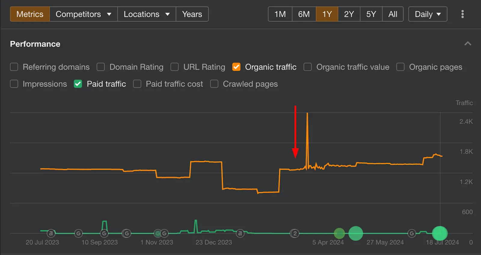
Interestingly, their homepage traffic has almost doubled in number, and seen an uptick in keyword positions post these changes.
Their previous copy on the website used keywords such as “edit”, “track”, “transcribe”, which was generic, but their newer copy has keywords such as “text to speech”, “captions”, and keywords that align it more towards the topic of a podcast recording software, contributing to their improved keyword positions. Their bounce rate also is at 48%.
The new design also likely improved user engagement by allowing visitors to quickly understand and visualize the product's capabilities.
Takeaway:
If you’re using an image or video in the hero section, ensure it adds extra context to the copy and isn’t just a placeholder. Riverside does this best by using visual or interactive components and incorporating these elements directly onto its homepage as a powerful way to engage visitors and demonstrate value.
8. Kommunicate: A/B Testing for CTA Optimization

Kommunicate, a customer communication platform, conducted A/B testing to optimize their call-to-action (CTA) and improve conversion rates.
The Problem:
Kommunicate's original CTA required users to input their email addresses to trial the product, which might have created friction in the conversion process.
The Solution:
Using VWO for A/B testing, Kommunicate created a variation of their homepage with a slightly different CTA approach.
Key Changes:
1. Modified the CTA to remove the immediate requirement for an email address
2. Simplified the initial engagement step for visitors
Results:
The variation with the less committal CTA significantly outperformed the control. The primary goal being tracked in the test was the number of clicks on the CTA button. The test was concluded in just 2 weeks. Variation 1 was declared the winner by VWO with a 25.53% increase in clicks on the ‘Try for free CTA’.
The case study indicates that reducing the initial friction led to higher click-through rates and potentially more conversions down the line.
Takeaway:
Reducing initial commitment can often lead to higher engagement. By lowering the barrier to entry, you can attract more users into your funnel and nurture them towards a full conversion.
9. Bitly: Leveraging Free Tools for Engagement

Bitly, the popular URL shortening service experimented with different approaches to their homepage CTA.
The Problem:
Previously, Bitly's homepage required users to input their email addresses to access the URL shortening or QR code generation tools.
The Solution:
Bitly redesigned its homepage to offer free access to its basic tools without requiring an email address upfront.
Key Changes:
1. Removed the email input requirement for basic tool usage
2. Added visuals improved the user experience for the URL shortening and QR Code generation tools on the homepage
Results:
This approach likely increased user engagement with Bitly's tools. By allowing users to experience the value of their service without commitment, Bitly potentially increased the likelihood of users signing up for more advanced features later.
Takeaway:
This "try before you buy" approach can be particularly effective for SaaS products. Offering free, immediately accessible tools can be an effective way to demonstrate your product's value and build trust with potential customers.
A quick roundup: Homepage optimization examples
These nine examples of homepage optimization showcase a variety of strategies that can significantly impact conversion rates:
- Kajabi demonstrated the power of shifting from company-centric to customer-focused messaging.
- Revolut illustrated how simplifying design can enhance user experience.
- Mailmodo showed the benefits of experimenting with demo buttons and video content.
- Scheduler AI highlighted the importance of clearly communicating unique value propositions in competitive markets.
- Rippling exemplified how to guide users through diverse product offerings.
- Cognism proved the effectiveness of clear messaging combined with interactive demos to let users experience the product's value firsthand.
- Riverside showcased the impact of demonstrating product functionality directly on the homepage.
- Kommunicate underscored the value of A/B testing in optimizing CTAs.
- Bitly illustrated how offering free tools can drive engagement and potential conversions.
How Storylane can help
Storylane can significantly enhance homepage optimization via interactive demos. By allowing potential customers to engage with a product directly on the homepage, these demos bridge the gap between product description and user experience.
This hands-on interaction can increase engagement, offer a better understanding of the product's value proposition, and ultimately lead to higher conversion rates.
Interactive demos eliminate the account creation or login barrier, making it easier for prospects to explore the product's features and benefits.
Wondering how you can showcase your product's functionality in real-time? Book a free demo and let Storylane help you turn visitors into customers.
Heading 1
Heading 2
Heading 3
Heading 4
Heading 5
Heading 6
Lorem ipsum dolor sit amet, consectetur adipiscing elit, sed do eiusmod tempor incididunt ut labore et dolore magna aliqua. Ut enim ad minim veniam, quis nostrud exercitation ullamco laboris nisi ut aliquip ex ea commodo consequat. Duis aute irure dolor in reprehenderit in voluptate velit esse cillum dolore eu fugiat nulla pariatur.
Block quote
Ordered list
- Item 1
- Item 2
- Item 3
Unordered list
- Item A
- Item B
- Item C
Bold text
Emphasis
Superscript
Subscript
Related Articles

If you're in the market for demo automation software, you've probably come across Storylane and Navattic. This comparison should help you differentiate between both platforms to guide your purchase decision.
Why GTM teams prefer Storylane
At a high-level, customers prefer Storylane for the product functionality, versatility, ease-of-use, commercial model, and rate of innovation.
1. Product functionality
Before diving in, here’s a quick overview of core features common to both Storylane and Navattic — really, they’re table stakes for any modern demo automation platform:
- Self-serve free plan: Build your first demo on your own, for free
- Browser extension: Chrome extension for click-based capturing
- HTML/CSS demos: Clickable, editable HTML-based demo capture
- App integrations: Your usual suspects - CRMs, Slack, Zapier, etc.
- Demo analytics: Account reveal, performance metrics, intent signals, etc.
And with that out of the way, here are a few ways Storylane stands out from Navattic...
1.1 Flexible demo formats
Broadly, there are two formats of interactive demos:
- Image demos: Screenshot or video-based demos with sequential steps. Limited scope to control on-screen elements and interactions, but quick to create and load.
- HTML/CSS demos: Clickable demos that capture the product's look, feel, and interactions. On-screen elements such as text, data, and graphics may be edited.
In their own words, Navattic only specializes in top-of-funnel HTML demos. Storylane, on the other hand, is expressly designed for both demo formats — complete with auto-capture, annotations, guides, blurs, zooms, presenter videos, voice overs, and more.

What does this mean for you? With Storylane, you have the flexibility to pick between demo formats based on your needs: image-based guided demos for your website, video demos for email campaigns, HTML demos for sandbox environments, etc.
This flexibility (coupled with the next set of differences) puts Storylane in an unequivocally stronger position when it comes to scaling demos across departments and use-cases.

1.2 Agentic demo automation with Lily AI
One of Storylane’s biggest differentiators against Navattic (and pretty much every other vendor in this category) is Lily, our demo automation agent. Broadly, Lily helps in two ways:
- Easier, faster demo creation for sellers
- Contextual demo discovery for buyers
Here’s a rundown of what you can do with Lily today:
- Create with AI: Generate or improve demos in seconds — complete with product-specific guides, prompt-based editing assistance, voiceovers, zooms, and more.
- AI Avatars: Pick from dozens of avatars or make one of yourself to generate studio-quality presenter videos. You have the option to manually record content in-app as well.
- AI HTML Editor: Customize HTML demo environments on the fly to meet ad hoc requirements. Edit text, images, and graphs with simple prompts — no code needed.
- AI Voiceovers / Translate: Choose from over 65+ voices (or record your own) and 25+ languages to expand accessibility and furnish your demos with a human touch.
As for discovery, think of Lily as a conversation product expert with as much information as your best sales person, available 24/7 to guide prospects through discovery and qualification. Coming soon.
Where’s Navattic at with all this? As it stands, they do not support any comparable features.
1.3 Demo Hub
Next up, we have Demo Hub: one of Storylane’s flagship features to address multiple buyer personas and use-cases in one place with galleries and playlists of demos. Galleries help marketers showcase a library of bite-sized product demos on their website (without overwhelming early stage prospects) while playlists help sales and presales teams share curated demo experiences with later stage prospects.

Navattic does not support any comparable feature to date. As it stands, Navattic’s response to Demo Hub is Demodash, an agency that charges as much as $2000 per demo to create demo centers for their customers.

1.4 Apps galore
Another key differentiator is Storylane's lineup of native apps. We’re the only demo automation vendors to support apps for Gmail, HubSpot, Salesforce, and Desktop (Mac).
- Try the Salesforce app, listed on the Salesforce AppExchange
- Try the HubSpot app, listed on the HubSpot marketplace
- Try the Gmail plugin
- Download the Storylane desktop app
These quality of life improvements are designed especially for sales teams to personalize and share demos without logging into Storylane (plus, easier change management is always nice).
You might be noticing a pattern here: To date, Navattic does not support this functionality — and given their focus on a limited set of use-cases, nor do we believe that they plan to. More on this next.
2. Versatility across GTM
Most demo automation vendors sell to a specific function. Saleo sells to sales. Consensus sells to pre-sales. And Navattic? Well they primarily sell to marketers. While there’s nothing inherently wrong with this approach, it can be a limiting factor when you’re looking to scale demo operations across departments and use-cases.
Storylane is specifically designed for horizontal adoption across marketing, pre-sales, sales, and even customer success, product, and development teams. The differences in product functionality highlighted above (coupled with under the radar features such as secure demo sharing and personalized links for email campaigns) are testament to this claim.

3. Ease of use
As for which demo automation software is easier to use, we’ll let numbers do the talking.


"Storylane makes it much easier to organize content with its tagging system for chapters and sections. While Navattic allows labeling, it lacks searchability and filtering capabilities, which becomes crucial when managing multiple chapters. I particularly appreciate how Storylane structures chapters with their own dedicated build sections. In contrast, with Navattic, when I created an 80-step process, it stretched into one long, horizontal sequence that required constant scrolling back and forth. Storylane's more concise organization makes me much more excited to build out product demos” - A customer when asked about how Storylane compared to Navattic
4. Commercial models
Upon initial inspection, Storylane is (slightly) more expensive per plan than Navattic. A closer look, however, reveals that we offer several features in our lower tier plans. To name a few:
- Lily AI (Available in Storylane’s free plan onwards vs unavailable on Navattic)
- Account reveal (Available in Storylane’s $40/mo plan vs. Navattic’s $1000/mo plan)
- Demo translations (Available in Storylane’s $40/mo plan vs Navattic’s $1000/mo plan)
- Demo Hub (Available in Storylane’s $500/mo plan vs unavailable on Navattic)
- Offline demos (Available in Storylane’s $1200/mo plan vs. Navattic’s enterprise plan)
- Demo coaching (Available in Storylane’s $1200/mo plan vs. Navattic’s enterprise plan)
If you really think about it, this probably translates to better bang for your buck. But what about the whole “unlimited seats” deal? Sounds great, sure — but how sustainable is it really? As your organization (and demo requirements) start to scale, it’s unrealistic to expect the same support for a 5 seat plan as a 200 seat plan. Another reason why Storylane’s value-based pricing makes more sense for the long run.
Edit: Recently, Navattic has also started capping their seats per plan. Goes to show that as a commercial model, the whole unlimited seats approach probably didn't work out as intended.
And there you have it! Both Navattic and Storylane are leading demo automation softwares — but when you break it down, it’s hard to argue against the latter. Storylane's objectively in the clear for most buying considerations: functionality, versatility, ease-of-use, and commercials.
5. On innovation - What’s next?
It may not feel like it (especially to us), but demo automation has only been around for a handful of years. As a category, we’re still in nascent stages. Unlike with established verticals such as CRMs or project management tools, it’s on younger companies like ours to innovate and push the envelope in these “early days” of demo automation.
Nitty-gritty comparisons aside, it’s worth sharing that Storylane has been at the forefront of this since day one. With category-first initiatives like self-serve PLG, Demo Hub, and more recently, Lily AI — innovation continues to be at the heart of our business. If you decide to go with Storylane, we hope the question “what's next?” excites you as much as it excites us!

From day one, our mission has been to simplify B2B buying and selling. When we launched in 2021, we recognized that product demos – a key touchpoint in most customer journeys – generated undue friction for buyers and sellers alike. From both a creation and discovery stand point, demos fell flat in terms of ease-of-use, accessibility, and scalability. This gap is exactly what we set out to close with Storylane.
A trip down Storylane
Storylane's growth has always been marked by industry-first innovations. We began by introducing interactive demos in 2022. The goal was to help teams build quick and simple demos for a range of marketing and sales use-cases. Soon enough, this put us on the map as the fastest, easiest-to-use demo automation tool in the market.
Next, in 2023, we became the first self-serve platform in our category. Here, our goal was to democratize access to demo automation for marketing, sales, and presales teams of all sizes. Today, we work with over 3000 companies ranging from early-stage startups to industry giants such as Microsoft, Gong, and Cognism.
Last year, in 2024, we recognized that one demo wasn’t going to cut it. After all, B2B purchase decisions involve multiple buyer personas, use-cases, and product lines. In such cases, it only makes sense to share multiple, context-specific demos with prospects.
After much anticipation, we launched Demo Hub; another category-first innovation designed to share multiple demos as galleries or playlists.
In 2025, Storylane goes agentic
We’ve done well to get to where we are today — but we know there’s still a ton of scope to simplify B2B buying and selling for everyone involved. We realize that:
- Sellers prefer spending their time on qualified, high-intent deals — not demo operations
- Buyers expect self-guided, context-specific product discovery — with minimal sales intervention
And so, in our attempt to address these all-too-common gaps in the buying experience, we're thrilled to announce Storylane’s boldest innovation yet: Lily, your demo automation agent.
Meet Lily: Your demo automation agent
Lily is a demo automation agent built for both buyers and sellers. She represents a fundamental shift in how we’ll be thinking about demo creation and discovery going forward, bringing in an agentic approach to Storylane’s existing line of demo automation products.
To start with, here’s what's in it for demo creators
1. Create with AI: Simply capture your product with Storylane's browser extension and leave the rest to us. Lily will create and optimize demos in a single click — complete with product-specific guides, annotations, and voiceovers.
2. AI Avatars: Pick from dozens of avatars — or make one of yourself. Share a script and generate studio-quality presenter videos in seconds. No camera, edits, or redos needed.
3. AI Voiceovers: Speak your audience’s language — literally. Generate studio-quality voiceovers in over 60 diverse voices and 25 languages.
4. AI HTML Editor: Customize demos on the fly to meet your prospect's unique needs. Edit text, images, and graphs with just simple, code-free prompts — Lily does the rest.
But wait…there’s more
All this? Just the beginning.
In March, Lily will evolve to support autonomous, contextual demo discovery for buyers. Imagine prospects exploring your product, right on your website, through intelligent conversations with Lily — getting exactly the information they need, when they need it — without any of the friction associated with traditional sales touchpoints.
In short, Lily will be a 24/7 tour guide — equipped with as much product knowledge as your best sales rep — to support buyers with contextual, self-serve product discovery.
Looking ahead: sales enablement & beyond
As we launch Lily, we're more committed than ever to our founding mission: eliminating friction in B2B buying and selling. We believe agentic demo automation represents the next frontier in B2B sales enablement, moving beyond static product demos to intelligent product experiences.
To our customers who've been part of this journey – thank you. Your feedback and trust have been instrumental in shaping not just Storylane, but the future of demo automation. And to those considering how to make their demo experience more effective and engaging – welcome to the era of agentic demo automation.
The future of product demonstrations is here, and we couldn't be more excited to help you tell your product's story in ways never before possible.

This time last year, we spoke about product-market fit and our journey to democratize demo automation. 2024 was about building upon that vision and momentum – and wow, what a ride it's been!
Over the past 12 months, we grew our revenue by 2.5x, expanded to over 16k teams, shipped a new feature every four days (yes, you read that right), and hosted our very own awards show. But let's back up a bit and explore how it all unfolded.
Shipping at warp speed
From day one, our goal has been to eliminate friction for software buyers and sellers with accessible demo automation products. In 2024, we doubled down on this commitment with over a hundred (100!) product releases, both big and small. Here are some of our favorites:
- Demo Hub: Build demo libraries that address multiple use-cases and buyer personas in a centralized gallery or playlist view. This was certainly our biggest launch of the year.
- Personal video & AI voiceovers: Bring an engaging, personalized human touch to interactive demos with Loom-style video recordings and AI voiceovers.
- Offline demos: Address the all too common challenges associated with unreliable, expensive WiFi at in-person events and conferences by downloading demos for offline use.
On the PLG front, we implemented convert CTA buttons, an advanced demo editing toolkit (blur, crop, screen layout, etc), as well as deeper analytics and lead attribution functionality, among others. All in all, the tremendous efforts from our product and engineering teams translated into serious business growth.
Growth that speaks volumes
In our previous review, we were thrilled about tripling our growth and establishing Storylane as a leader in the demo automation space. Looking back at 2024, we're humbled and so, so excited to see this momentum continue.
- Revenue grew by 2.5x
- Expanded to 16k+ teams
- Brand search tripled (3x)
- Website traffic surged by 20x
- Our ACV increased by 50%
- Last but not least, we acquired a company! - Storylane acquires PreSkale, expands into presales
Each one of our customers validates our vision and pushes us to innovate further. This year, we're particularly proud to welcome industry giants such as Microsoft, Pearson, Nasdaq and Silicon Valley Bank to our growing list of enterprise customers. Needless to say, we feel the love ❤️
- 60 million+ mins spent watching Storylane demos, 10x more than last year
- 85k+ Storylane demos created
- 5 million demo views per month, 4.7x more than last year
Making some noise (the good kind)
Go-to-market was all kinds of fun in 2024. There’s just way too much to cover, but here are a few highlights that helped us stand out in an increasingly competitive demo automation category.
- Website redesign: Our website went through a complete overhaul earlier this year. This revamp – complete with bright colors and bold styling – reflects our move upmarket.
- Demo-led SEO: What started off as an experiment, Storylane’s demo-led SEO BLEW UP in 2024. Our podcast with Exit Five on the topic has gone on to become their most popular post in the community!
- An eventful year: We took the show on the road at Product Marketing Alliance Summit, Exit Five’s Drive, SaaS Open, G2 Live, and a handful of other fantastic events — a great chance to connect with our community and beyond.
- Customer reviews: Our customers have been incredibly supportive, with over 500 G2 reviews. Out of 145,000+ products. and over 2,100 categories, Storylane was the only demo automation platform in G2's top 100 fastest growing products!
- PreSkale acquisition: Storylane’s acquisition of PreSkale comes at an exciting time, marking our strategic expansion into the presales market in 2025. Read all about it here.

A few more initiatives that helped us make a lot of noise: Demo Dundies (our spin on conventional webinars, themed around The Office’s Dundies), product marketer affirmation cards (a deck of painfully relatable affirmations for our friends in product marketing), and Demo Kitchen (our recipe book inspired series of customer case studies).

40+ Storylaners and counting
As our team continues to grow, we've maintained the supportive, high-performing culture that's been our foundation for four years. This year, we welcomed our first People Success hire and celebrated team achievements with offsites in Bengaluru and Bali.

What’s cooking in 2025
If you thought 2024 was exciting, wait till you see what we've got in store for 2025! We're all set to take demo automation into sci-fi territory with first-of-its-kind AI functionality. We can’t spill all the beans just yet but picture this: an AI demo agent to polish, scale and show you personalized demos.
To our team, customers, and the entire Storylane community - thank you for being part of this journey. We're just getting started, and we couldn't be more excited about what's ahead. Here's to another year of pushing boundaries and helping you create amazing demos!
.svg)
Make buying easy with Storylane
Chat with our demo expert to find out how 2500+ companies use Storylane to drive more revenue

.webp)