The phrase “sell while you sleep” isn’t just a catchphrase coined for fun. It comes from the often-overlooked ability of landing pages to drive passive sales.
While you’re fast asleep, landing pages can capture lead information, boost search performance, and drive conversions 24/7.
When the landing page conversion rates go up, the average cost of customer acquisition comes down, and revenue hikes up. But if the landing page fails to convert? That’s another marketing dollar lost from your already dwindling budget.

To increase the conversion rate for your landing page, you’ll need more than just an irresistible offer. Here are 16 practical tips and timeless wisdom from product marketers and conversion rate optimization experts around the world. Dive in!
What is a Landing Page?
A landing page is a standalone page designed to convert targeted traffic coming from Ads or marketing campaigns into leads or potential customers or simply from organic search results. It is displayed after someone clicks on a campaign link mentioned in a social post, email, or Ad around the web.
What Leads to Poor Landing Page Conversion Rates?

While the landing page conversion rates vary from one industry to the other, there are some common landing page red flags. These include:
- Too many or too vague CTAs
- Poor quality UX making your landing page look dodgy
- Unclear USP or value proposition
- Inconsistent messaging between the title the user clicked on and the landing page
- Too many clickable elements cause distractions
- A lengthy lead form
- Cluttered design or copy causing cognitive overload
- Forgettable headline, messaging, or design
Yes, such trivial mistakes are costing you potential customers every minute. But it’s nothing you can’t fix with small to significant tactical changes. Let’s see how.
16 Proven Ways to Increase Conversion Rates for Landing Pages
Here are 16 expert and data-backed tips to increase the conversion rate of your landing pages.
1. Add Interactive Product Demos to Boost Engagement
Videos are the ultimate cheat codes to increase the conversion rate for your landing pages by 86%. But how?
As Kyle Kuczynski of MessageDesk explains: “People simply want to know more than just the solution you're offering. They need to visualize everything so they'll know what to expect once they request a demo or try out the tool.”
Since there’s less cognitive load on visitors to process the video over text, they’re also better at engaging. For example, providing interactive demos to website visitors helped Fulcrum, SaaS ERP for manufacturers, generated a whopping 400+ leads. In Tabular’s case, a data automation platform, providing interactive demos resulted in a 15% conversion rate.
But there’s one caveat.
Your landing page video must be relevant and persuasive without distracting the visitor from the conversion action. Besides, adding a touch of personalization can also help with this.
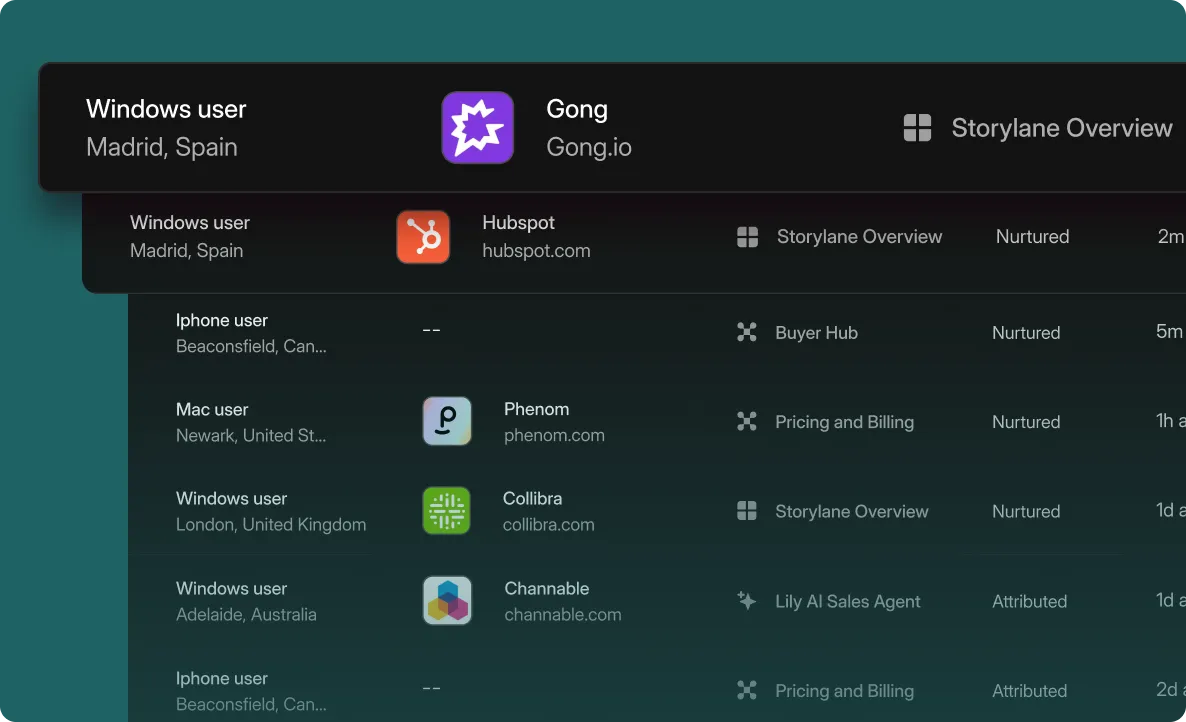
If you want to create personalized or interactive product demos, give Storylane a go. You can capture a variety of product workflows and design custom walkthroughs to match the different stages of the buyer journey. That too, in just 10 minutes!
2. Have a Single, Well-Defined Conversion Goal
It’s painfully obvious when a landing page doesn’t have a clear conversion goal. Its value proposition is unclear and the copy is unfocused, so visitors bounce off to better alternatives.
Exhibit A

If you’re not sure how to pick a conversion goal, try to answer this question: When a visitor lands on your landing page, what’s the next logical step they should take? Start a free trial? Subscribe to your newsletter? Book a sales call?
That’s your conversion goal right there. And now you can decide on an appropriate conversion action (CTA) as well.
3. Monitor How Visitors Experience Your Landing Page
Before jumping the gun and misdiagnosing the lower conversion rate, try to step back and into the shoes of your visitors. How do THEY experience the landing page?
To get an accurate picture of the customer journey, Coty Perry of Anglers recommends “using heat maps and user surveys to figure out what content visitors actually want to see. The main thing is to test, test, test. Headlines, CTAs, the colors of the buttons — you'd be shocked what actually makes an impact when you try things out.”
You can use software like Hotjar for heat maps and get a deeper understanding of user behavior, including:
- Where do most of the visitors drop off?
- Which elements get the most clicks?
- Are they clicking on a non-clickable element?
- Do they read the landing page in a Z-pattern or an F-pattern?
By pairing heat map analysis with qualitative research and user feedback, you can also diagnose and run corrective A/B tests to see what user experience or copy changes make the most difference.
4. Add Product Walkthroughs to Showcase Expertise
Harry Dry of Marketing Examples said it best: Show off your product in all its glory. The goal is to get as close to reality as possible.
Showing the context of use, and how the product provides value in day-to-day conditions, is a simple way to increase the conversion rate for the landing page. This can be done via well-produced product walkthroughs or product tours – just as Gong offers on its homepage.

Rohit Chavane of Keyhole shares how they increased average conversion rates by simply ungating the product experience.
This was the original homepage's hero section:

This is what they tested out:

Here are the results they saw:
“People who used the product (using the search box option on the second version) before starting a trial converted at a higher rate into paid customers than those who didn't use the product.”
5. Align Pre and Post-Click Experience
Clicking on an Ad and not getting the promised value can feel a lot like getting catfished. This clickbait-y experience might even leave a bad impression on the visitor.
The solution? Aligning the pre and post-click experiences. Here’s how to diagnose and optimize:
- Is the messaging the same pre and post-click? What about the landing page headlines, creatives, and keywords? A message match consistency is vital for conversion.
- Is there a high contrast for elements you want to stand out? Like the CTA button? Hero copy? Similar use of color and creatives is equally essential.
- Does the copy influence and direct the visitor to take the conversion action? After all, the sole purpose of the landing page is to get the visitor to click on the CTA.
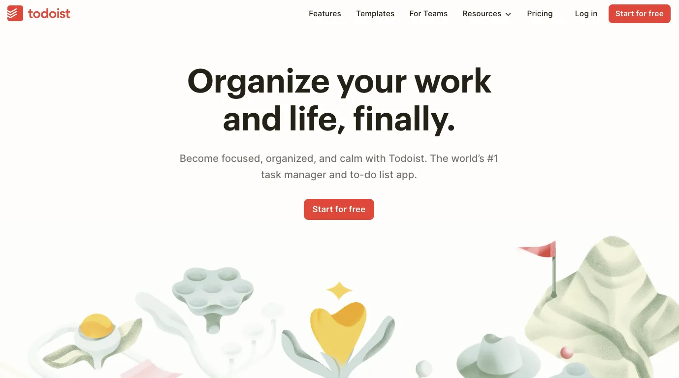
See how Todoist does it.
Pre-click message:

Post-click message:

6. Provide a Relatable Above the Fold (ATF) Experience
This is your 3-second window to WOW the brains out of your visitors. How well you design that first landing experience will decide whether or not they’ll continue to scroll down the page.
As David Bitton of DoorLoop explains:
“Ensure you have highly relevant, enticing, and valuable content dominating your above-the-fold area. Emphasize what will resonate most with your unique audience.”
This means mapping the landing page copy to a singular ideal customer persona – even if you serve multiple ones. And how do you do it?
Here’s a lesson from Julian Shapiro:

7. Write a Benefit-Focused Headline
David Ogilvy once famously remarked, "On average, 5x as many people read the headline as read the body copy. When you’ve written your headline, you’ve spent eighty cents out of your dollar.”
So, make sure your headline is the biggest attention-grabber above the fold. To do so, User Motion’s Zeynep Serra Avan suggests staying away from exaggeration and using direct language instead.
“If the main header contains the word "magic", it means nothing. Especially if you are working B2B, your target profile probably won't be fooled by these. You need to state the problem, solution (you), and benefit in the shortest and most direct way you can.”
Also, don’t forget to make the headline search engine-friendly. Use a tool like CoSchedule’s Headline Analyzer to get a score for your headline’s quality and shareability. It can help you optimize the Ad and landing page copy with the relevant search term.
8. Make Sure Your Value Proposition is Conveyed Clearly
Can visitors tell what value or benefits you’re offering upfront?
Michael Nemeroff of Rush Order Tees vouches for clear value messaging, advising marketers to: “Highlight the greatest benefit in the hero section of your landing page and include a call-to-action nearby, above the fold. You don’t want to waste time when you’re this close to conversion. “
Iterating the importance of writing a customer-centric copy, he continues:
“Leverage the landing page to reinforce how your offer can improve the customer’s life so they feel compelled to click on the buy button.”
9. Include Testimonials & Other Social Proofs to Boost Credibility
Nothing says “We’re trustworthy!” as a well-done customer testimonial does.
Social proofs like user reviews, user-generated content, earned media, or personal recommendations are the ultimate stamp of quality. And mark Varnas of Red9 agrees:
“My number one rule of landing page conversion is this: social proof is everything. Over the past 20 years, we've shifted from an online engagement model of "trust until proven otherwise" to an immediate distrust businesses have to work to change. That means testimonials, case studies, and previous client logos are your best friend.”
But here’s the catch. In the age of deep fakes and paid ratings — how hard can it be to forge authentic-sounding testimonials?

Yep.
He adds further: “The answer to avoiding being seen as just another salesman is to show off your previous wins.
Authentic client testimonials win over everything else. Once the reader sees that someone (or some company) they admire has been where they are right now (perhaps even on the same landing page!) — they're much more likely to convert!”
Here’s how we follow what we preach at Storylane!

10. Use Only One, Clear CTA on Your Landing Page
Unbounce’s study revealed that landing pages with one, clear CTA (or a link) earn 13.5% conversions as compared to 11.90% conversions of pages with 2 to 4 links.
Yet the most common mistake marketers make? Not having one, clear CTA.

Talking about the importance of using a clear CTA, Matthew Ramirez of Rephrasely says, “You should make sure the CTA button says something like “Sign Up Now”. You don’t want the button to say “Contact Us” or “Learn More”. You want it to be very clear what your CTA is asking the user to do. “
He also suggests placing the CTA in an easy-to-locate position – remarking: “A good CTA will be in plain sight, easy to find, and will have a very clear action for the user to take.”
And remember the pearls of wisdom from Unbounce’s Oli Garder: “Anything placed in close proximity to your CTA should be A/B tested – it’s a sensitive area.” That includes elements like privacy policy, disclaimers, special offers, or lead magnets.
11. Bring the Attention Ratio Down to 1:1
Attention ratio is the ratio of links and other interactive elements on a landing page to its number of conversion goals.
You want visitors to click only one button — and that’s the CTA button. So it only makes sense to have just one clickable item on the landing page.
Logically? Yes. But the findings from a study by Crayon.co paint a mildly amusing picture.
“A whopping 96% of landing pages feature at least one link, leading prospects off-page. Most of these pages, 40%, feature 1-3 links, followed by 28% with 4-6 links, 13% with 6-9 links, and 14% with 10 or more!
Only 4% of landing pages have no links at all.
12. Keep Optimizing Your Lead Capture Form
Most lead capture forms have a lot of friction. It could be weak messaging, a lack of value on offer, or an irrelevant CTA. Or ineffective form design, as was the case with Mailmodo.
“One key thing that helped us increase the demo rate from our landing page was improving the UI and UX flow of the demo form.
Initially, we had a non-native form that had bad graphics and UI design. Also, it contained a few repetitive, redundant steps that we removed.
We saw a demo increment of 53% once we fixed and implemented these changes.” informs Mailmodo’s Zeeshan Akhtar.

But in most cases, the leading cause of poor conversions in lead generation landing pages is the form length. An average landing page features a lead capture form with 5 or more form fields for the visitors to fill out.
While there is no conclusive, correlating data between the fields of signup forms and conversions, reducing the number to 2 or 3 form fields is deemed practical. The idea is to keep testing to find the most optimal lead capture form.
13. Be Extra Mindful of the Visual Hierarchy
Visual hierarchy is the principle of arranging key elements to show off the order of their importance. Put simply, it’s the art and science of guiding the eyes from one element to the other in a strategic order.
To do so, you pay attention to
- The placement of visual and textual elements. Is the visitor’s attention directed to important elements like CTA and value proposition?
- How size, color, contrast, and white space are used to drive actions. Is the headline text bigger than the subhead? Is there proper contrast between the background media and the CTA button?
14. Reduce the Landing Page Loading Time to 1 Second
The world likes to move fast. And so do buyers. So the sooner you deliver the value, the better. According to Portent’s study, a loading time of 0 to 2 seconds is ideal. Any longer than that, and the landing page conversion rates start to drop lower.
Just consider this: Landing pages with a loading speed of 1 second saw 3x higher conversions than a landing page with a loading time of 5 seconds.

Here’s some collective wisdom on how to improve the page loading speed:
- Minify HTML, CSS, and JavaScript
- Get a content distribution network
- Make the response time faster
- Use file compressions
15. Remove Elements That Distract from the CTA
The probability of conversion can drop by 95% if the number of elements — text, titles, images — on a landing page goes from 400 to 6,000. They can distract the visitors and cause unnecessary friction, which is — to quote Oli Gardner again (He’s the landing page sensei, after all!):
“..the psychological resistance that your visitors experience when trying to complete an action. Friction is a conversion killer usually caused by unclear messaging, lack of information, or poor layout.”
Here’s how to check and eliminate a textual or visual element on your landing page.
- Do the elements actually add any value? No? Remove.
- Do they steal attention away from the CTA? Don’t think twice, remove.
16. Make the Landing Page SEO and Mobile-Friendly
You need search engine optimization to boost discoverability and mobile responsiveness to get a one percent higher conversion rate than landing pages without one.
“Think SEO and what search terms your customers are using to find you,” recommends Mailmodo’s Zeeshan Akhtar. “When you optimize, also consider mobile traffic. With most traffic on mobile, not optimizing for mobile is a big missed opportunity. Test on all devices.”

4 Brilliant B2B Landing Pages to Steal From
Here are four successful landing page examples we can’t stop recommending. They’re 10/10 in engaging and hooking the visitor from the get-go. Let’s see why.
1. Basecamp

What we love about the page
- Bold emphasis on “small teams” for specific targeting
- Empathetic messaging using the cartoon blurbs
- A prominent, specific CTA
2. GitHub

What we love about the page
- A one-field signup form for quick access
- Highlights of GitHub users across demography add credibility
- The high color contrast between the headline and the background
3. n8n.io

What we love about the page
- The GitHub rating next to CTA establishes trust
- Using a product screenshot as the hero image makes the visitor curious to explore
- A benefit-focused headline
4. HeyTaco


What we love about the page
- Bold keywords in the subhead: recognize, fun, celebrate. They convey the value proposition clearly.
- Placing CTAs with different intents together. Allows visitors to pick the option they find comfortable.
- The badges of honor from third-party review sites
Is Your Landing Page Converting Yet?
With the above tips up your sleeves, you’ll be on track in no time. Just remember landing page optimization is a marathon, not a sprint. It takes time, many tests, and much more patience to execute high-converting landing pages.
Related Reading
“Coming Soon” Landing Pages That Convert
SaaS Landing Pages Best Practices You Must Follow
Genius Landing Page Optimization Examples to Boost Conversions

.svg)
.svg)


.png)


.svg)

.webp)